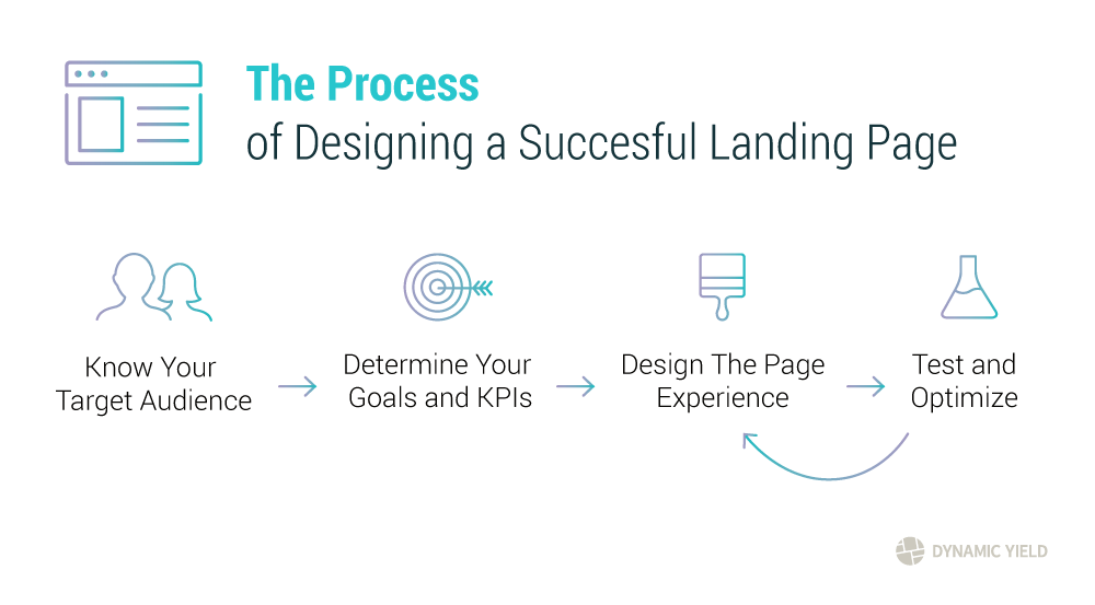
The Fine Line Between Attraction and Distraction: What Your Landing Page Should Avoid
The fine line between attraction and distraction on your landing page is crucial for maximizing conversions. A visually appealing design can draw in visitors, but too many distractions can lead to high bounce rates. To ensure your landing page captures attention without overwhelming users, prioritize simplicity. Elements such as clear headlines, intuitive navigation, and prominent calls-to-action (CTAs) are essential. These features should guide users toward the desired action, whether it’s subscribing to your newsletter, making a purchase, or accessing premium content.
Another common pitfall is clutter. Too many choices can confuse users and lead to decision paralysis. Instead, streamline your offerings by presenting only the most relevant options. Use whitespace effectively to create a balanced layout that emphasizes the important elements. Additionally, include social proof through testimonials or user reviews to build trust without bombarding visitors with unnecessary information. Remember, your landing page should attract visitors with enticing content while avoiding distractions that could drive them away.
First Impressions Matter: Key Elements Every Landing Page Needs to Captivate Visitors
First impressions matter more than ever in today's digital landscape, where visitors decide within seconds whether to stay or leave your website. A captivating landing page serves as a gateway to conversions, and incorporating key elements can significantly enhance user experience. Begin with a clear and concise headline that addresses the visitor's needs or solves their problems. Pair this with an engaging subheadline that further explains your value proposition. Don't forget to include high-quality visuals or videos, as they can quickly communicate your message and keep visitors engaged. For more on effective headlines, check out this guide on writing headlines.
Another crucial aspect of a landing page is its call-to-action (CTA). The CTA should be prominent and compel users to take action, whether it's signing up for a newsletter or making a purchase. Use contrasting colors and action-oriented language to make it stand out. Furthermore, social proof, such as testimonials and customer reviews, can build trust and credibility, which are essential for winning over potential customers. Lastly, ensure your page is optimized for mobile devices, as a significant percentage of web traffic now comes from smartphones. For tips on optimizing landing pages, visit this resource on landing page optimization.
Are You Making These Common Mistakes on Your Landing Page?
Landing pages are crucial for converting visitors into leads or customers, but many businesses make common mistakes that hinder their success. One frequent error is having a cluttered layout. When a landing page is filled with excessive text, images, or links, it can overwhelm visitors, making it difficult for them to understand the main message. To combat this, ensure your landing page is well-structured and focused on a single objective. Use clear headings, concise text, and strategically placed images to guide the user’s attention.
Another common mistake is failing to include a strong call to action (CTA). A clear and compelling CTA drives users to take the desired action, whether it's signing up for a newsletter or making a purchase. If your CTA is vague or hidden, visitors may leave your page without taking any action. Consider employing contrasting colors and persuasive language for your CTA button to make it stand out. For more insights on effective CTAs, check out this Neil Patel article that provides valuable tips.