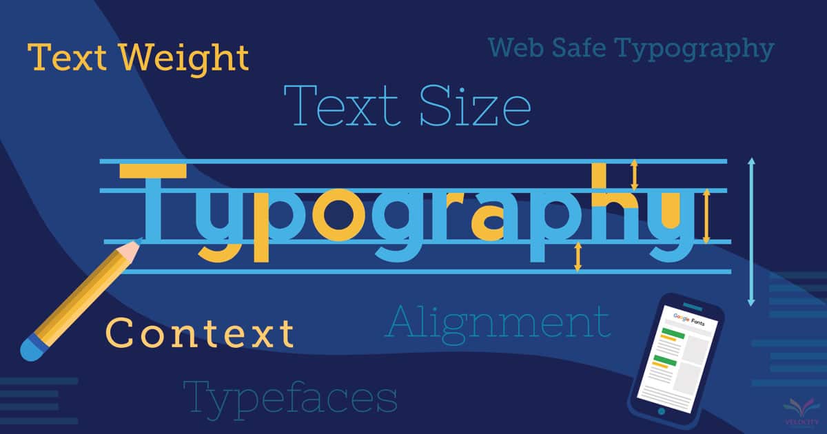
5 Essential Typography Best Practices for Streamlined Web Communication
Typography plays a crucial role in web communication, and implementing the right strategies can significantly enhance user experience and content readability. One of the essential typography best practices is choosing the right font pairings. Opt for a primary font for headings and a complimentary secondary font for body text. This contrast not only helps in emphasizing the hierarchy of content but also facilitates easier scanning of information.
Another key practice is maintaining appropriate line spacing, commonly referred to as line height. A well-calculated line height (typically 1.5 times the font size) can make text more legible and less intimidating. Additionally, utilizing responsive typography ensures that your content looks good on all devices. By using relative units like em or rem, you can allow your text to scale seamlessly, creating a better user experience across various screen sizes.
How to Choose the Right Font Pairings for Clear and Effective Design
Choosing the right font pairings is crucial for achieving clear and effective design. The first step is to understand the hierarchy of your content. Use a primary font for headings that conveys your brand's personality—this might be a bold sans-serif for modern designs or a classic serif for more traditional aesthetics. A complimentary secondary font should be selected for body text, ensuring it is legible and aligns with the tone of your primary font. For instance, pairing a decorative script font with a clean sans-serif can create a striking contrast that captures attention while maintaining readability.
Another vital aspect of font pairing is establishing a contrast that enhances user experience. Aim for a clear distinction between your heading and body fonts by selecting styles that vary in weight or style. Additionally, consider limiting your choices to two or three fonts to maintain visual cohesion. A good rule of thumb is to experiment with size, spacing, and line height to ensure that your text is not only visually appealing but also easy to read. Testing different combinations in real design scenarios can help you determine what works best for your audience, ultimately elevating the effectiveness of your design.
The Psychology of Fonts: How Typography Influences User Experience
The choice of fonts in design is more than just an aesthetic decision; it plays a crucial role in influencing user experience. Different typography can evoke various emotions and perceptions in the reader. For instance, a serif font can communicate tradition and reliability, while a sans-serif font may convey modernity and simplicity. Understanding the psychological impact of font choices is essential in crafting effective user experiences, as it can guide users' feelings and reactions towards the content presented to them.
Moreover, the legibility of fonts is vital for maintaining user engagement. Research shows that well-chosen typography can enhance readability and information retention. Designers can use principles such as contrast, spacing, and hierarchy to make the text more digestible. By ensuring that your fonts align with the overall mood and purpose of your content, you can significantly enhance the overall user experience, creating a seamless and enjoyable journey for your visitors.